My objective was to develop a digital solution to assist people with online travel planning and organization. I uncovered prevailing needs of travelers and used research findings to strategically design a hypothetical itinerary management system. I practiced the design thinking process to innovate this truly user-centered experience.
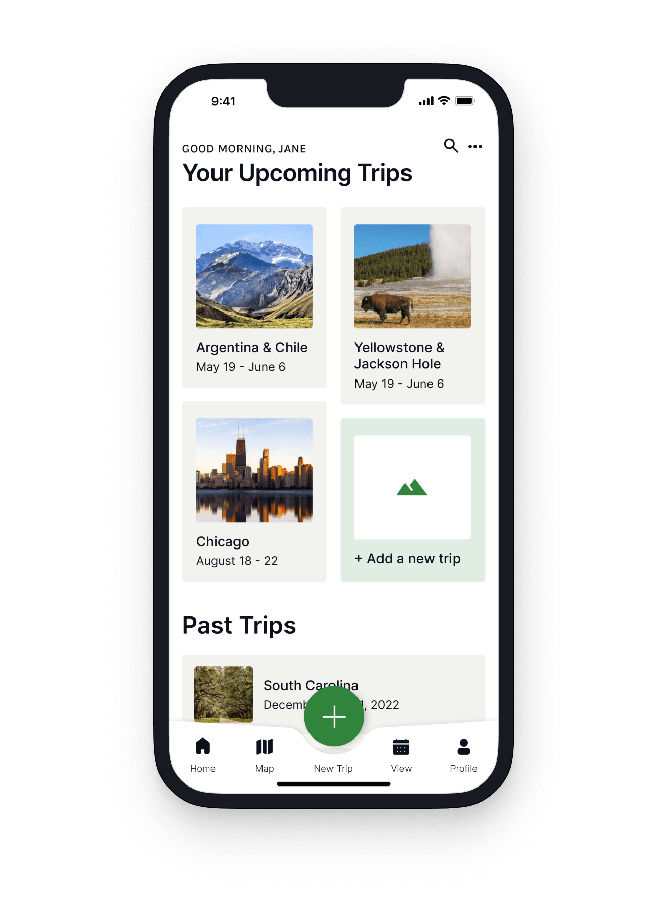
Skip is a smart trip itinerary platform made for busy people. It allows users to quickly and intuitively create organized, detailed, and completely customizable itineraries. This app leverages the power of AI to increase efficiency and personalization. With Skip, users effortlessly input travel plans, allowing them to optimize the value of their trips.

Many travelers are, as they often struggle to manage travel plans on top of already busy schedules. Sifting through hundreds of online resources and organizing important details is often overwhelming and time-consuming. Not only that, but searching for necessary information during travels is also a disjointed experience for many.
In order to gain empathy and understand current travel planning experiences, I interviewed 6 people about their behaviors, motivations, understandings, and frustrations. I took a qualitative, open-ended research approach in order to maintain an exploratory nature and gain contextual understanding.


I used an affinity diagram to make sense of this data. I sorted, grouped, and identified insights according to higher-level trends. This helped me to synthesize the most common and frequent pain points users experience with their current travel processes:


Using my research, I developed three user archetypes to frame the newfound problems in detail and build empathy for these target user segments.


By pinpointing well-defined user groups, I could hone in on the issue and brainstorm strategic digital solutions. This process yielded a number of ideas, requiring another synthesis aimed at prioritizing primary features.
Travelers struggle to manage online trip planning stressors on top of their busy schedules. They need an organized and customizable planning database that streamlines the process and allows them to maximize the value of their trips.
I generated an influx of ideas to solve this problem, but quickly realized it would be impossible to tackle all in a 4-week sprint. I reworked the initial feature prioritization matrix and identified viable, feasible, and desirable objectives to focus on first.

Collectively, these friction-reducing advantages will significantly enhance an individual’s travel experience.


At this point, it was essential to evaluate platforms that might already fulfill the primary goals previously outlined. I identified three exceptional platforms that served as very close competitors, initially concerning me.

I strategically examined Skip's unique value proposition: Skip differentiates itself as a simple, inuitive, organized and accessible interface with a time-saving AI assistant to create unlimited, customized itineraries at no cost.
With a strong awareness of Skip’s features, users, and competitors, I started defining the user journey which helped me visualize the steps and stages of the experience for the target user. This was all about tying it back to the user based on those archetypes.

I further established this seamless travel solution by determining the task flow. The initial flow was iterated upon multiple times as I improved the UX in the following stages, but below is the final chart for creating an itinerary.

With a fundamental understanding of Skip's functionality, I began sketching the flows.

To see how successfully and quickly users could navigate through primary tasks, I conducted 4 rounds of testing. I iterated per behavioral observations, voiced concerns, and design best practices. Task Success Rate was 100% in all tests, but these qualitative insights drove each iteration.

Below are screens that endured major UX changes, along with explanations for the decisions I made.


Users were able to complete tasks without any friction during the fourth round of testing. They notably enjoyed the "surprise" of the itinerary view screen after finalizing their hotel plan. I successfully addressed user need for an organized and customizable itinerary system on-the-go. Although this is the minimum viable product, this app would positively impact a users' travel experiences.


This project allowed me to practice the UX process for the first time and learn from my mistakes along the way. Although I hardly scratched the surface, I feel that I learned so much about UX/UI and grew tremendously as a designer. I found joy in the science of research and testing and leveraged my passion for communication to translate user problems into intentional, actionable solutions. There is always room for improvement, but feedback during testing about the usability of Skip was overwhelmingly positive. I learned to scrap designs for improved iterations, something I initially found challenging coming from a detail-oriented, visual design background. I am proud of the solution I created and, as always, am eager to grow and learn more.